I began this project thinking about how clothes cause me to forget how my body feels , how my fat fills my skin , how my bones stick out of my back. Within my photography, as a practice, I am interested in photographing what is in my head, what is not tangible. To me this means exploring the uncanny and having an image only I can understand fully. Through my project I hoped to come to understand how I think about bodies in a negative and positive way, in hopes of honouring them. I want to document the different facets of myself that interact with body image and explain how everything, to me, relates to this. I plan to mainly focus on fashion, inherited beauty , bodies in relation to intimacy and bodies as a changing thing that still have value even when you may hate you own body. I want to share nothing with the viewer, I want to create photos that people can relate to whilst sharing nothing about myself. I want my own thoughts, feelings and secrets to be embedded in both the photo and its creation whilst not being accountable for anyone's feelings of their own body. I wish for the viewer to experience a reflection on themselves and an acknowledgement that for each person there is an individual set of self- and societally-inflicted restrictions on how they live within a body. I hope that these two points help the viewer to come to a place where they feel an acknowledgment of their own struggle within their body and a respect for other's struggle. I have researched surrealists such as Duane Michaels who have a similar urge to document unreal things that exist within themselves. Within Michaels' work I have noticed themes involving imagery surrounding innocence, knowledge, intimacy, god and things only Michaels can know and understand but which I, as my own individual and photographer, can put my own meaning on.
The Female Gaze
Nan Goldin
Nan Goldin has long been an inspiration for me. Her ability to capture women's beauty and freedom especially during the Aids epidemic in the queer community, encapsulated a sense of resilience. In the early 70's Goldin moved to the city and into downtown queer communities where she 'fell in love' with drag queens. Her work put the performers in a god-like position rather than as strange disturbed people as they were often portrayed. Using Cibachrome prints, Goldin made photos with intense colours and high resolution that captured light, creating intimacy. Goldin photographed children in a way to normalise these spaces and show them as not being 'queer' or freakish. Goldin's art is also feminist and criticised photographers who used women in their work inappropriately and calling the 'heroine chic' style in advertising "reprehensible and evil."


|
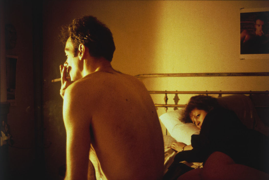
This image, 'Nan and Brian in Bed, New York City' is part of The Ballad of Sexual Dependency, a sequence of more than seven hundred colour slides of Goldin’s friends and family, accompanied by a soundtrack. The image is bathed in a warm light that seems to be an expression of Goldin's admiration for her lover yet the light splits the room down the middle of the image, separating the two. The light hits the man's face and the front of his body, his back in the shadows of the room exaggerating the fact he is turned away from Goldin. Goldin composed this image meaning her feelings are contained in the composition; he is not in focus despite being explicitly highlighted. I think this was done to make the viewer see Brian as Goldin did while focusing more on her longing for him.
|
|
Francesca Woodman


|
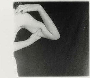
This photo is most directly linked to my project as it is implied that Woodman is interacting with her own body and documenting its movement. The pinching of her arm creates an exaggerated shape in the arm yet feels medical when combined with her bare chest as if it is an exam. As her left arm holds her shoulder she shows care for herself. The composition doesn't follow the rule of thirds as the focus is on the crook of her arm, however she is mostly out of frame giving her some anonymity - this could be any woman. The light creates high contrast with it bouncing off her skin. |
Radical Feminism - Richard Salton
|
This book was created by Richard Salton, a man. It is a curation of many radical feminist photography. Radical feminists believe that the personal is political with a focus on women in the home, sex and the role and extent of the patriarchy. This has since been criticised for its focus on white middle class women and replaced in the mainstream with intersectional feminism with its emphasis on marginalised identities. Whether the women in this book would call themselves radical if they were working today is up to how we define feminism and how it changes over time .
|

|
Friedl Kubelka
Kubelka took many portraits of women, iconic for her contact sheet such as her collection of women's faces. These are part of a collection called 'Pin Up', a comment of the pin up style of the 50s, not overtly sexual but made sexual by the fact it was solely for women. Kubelka took dozens of these images. i like that these images feel impersonal whilst being overtly intimate as if there is a disconnect. They seem almost soulless and passionless as if she is fulfilling a role by taking them. This affect is achieved by her face being hidden by the camera as she is focusing on the result of them rather than the experience.


Claude Cahun
Cahun is a revolutionary both politically and as an artist, and was one of few women in the early surrealist movement. Cahun brought up questions of whether photography is just the documentation of reality. Their poetry, occasionally attached to their images, was poetry that criticised gender roles, modern day social boundaries and capitalism.


|
This image is not a performance more than it is a representation of a part of Cahun. Cahun took many of their photos alone in a small village in France. While their costume is feminine their stance is rigid which makes Cahun look uncomfortable. Their white dress and shiny wings make this image have less contrast than many of their other photos. There are not many shadows in this image due to the lighting used which brings the image out of reality. This photo may not bee seen as surrealist due to its simplicity however the political nature of Cahun in photographing themselves and the time period the work was created.
|

|
Jo Spence
Jo Spence focused on many political images surrounding the home and women's responsibility , as the book focuses on her work associated with breast cancer. I think it is important to notice the importance of the disease in feminist spaces. Due to lack of funding, women are told immediately to remove something that is the most valued by men.


Renate Bertimann
Bertimann is probably the most abstract of the artists due to her performance art. She focused on a radical view of women's bodies especially involving their sexuality and the representation of sexuality and eroticism within a social context. Bertimann’s work distinguished itself by its inclusion of the masculine point of view going against the women’s art movement in the 1970s, revolting against a male-dominated world. Her work often explores women that look non-human with witches fingers and masked faces. She also uses examples of women's liberation to suggest that they have an over-inflated importance to liberation by literally inflating them or making them look like tools of torture.


These photographers inspired me to look at womanhood through different lenses. For example, the expectations of women in art as subject and creator, the representation of feminine things and feelings, and the immortalisation of the women in my family as part of me and my work.
Heavenly clothing
Happy victims - Kyoichi Tsuzuki
This photo book explores the wardrobes of people who have dedicated their lives, houses and income to a specific brand or designer. The images all have different compositions and styles. The images with the subjects' face covered or facing away from the camera are haunting as the subjects seem to be lost within their clothes and obsession. The title 'Happy Victims' suggests that these people are victims of a designer or their obsession.


This is my favourite image in the series due to the lightness and the depth. The big window and net curtain add to the positive space to create an image that seems less grim and obsessive than the rest. This photo also contrasts the rest of the photos as the clothes aren't hung up with care, they are just strewn across her bed. I think this shows a kind of naturality with the her clothes. I see them as an extension of herself. The nets provide a frame around her creating grandure. As the woman is covering her face two things come to mind - is she ashamed of her collection? or is this an invasion of her privacy?

This is my favourite image in the series due to the lightness and the depth. The big window and net curtain add to the positive space to create an image that seems less grim and obsessive than the rest. This photo also contrasts the rest of the photos as the clothes aren't hung up with care, they are just strewn across her bed. I think this shows a kind of naturality with the her clothes. I see them as an extension of herself. The nets provide a frame around her creating grandure. As the woman is covering her face two things come to mind - is she ashamed of her collection? or is this an invasion of her privacy? |
My reaction
To someone who doesn't love clothes the idea of combing through eBay , spending your whole paycheque in charity shops and cramming your wardrobe full may seem idiotic, but to those who care these acts are a form of self love and expression. I documented the love i have for my clothes by taking photos of my clothes, lighting them to create heavenly imagery.
|
|
|
|
|
|
i filmed the shoot so that I could screenshot the videos and have a wider choice of images but I think the videos stand on their own as my interaction with the clothes is shown in my care for the clothes.


i think this shoot went very well as I was able to use light to make the clothes look angelic. I filmed the movement of the clothes as well as using a longer shutter speed to photograph the clothes in motion. I also photographed myself interacting with the clothes in a way that showed my admiration for them. My favourite photos are the ones with light flares as I feel they are more angelic and surreal. The idea of using photography techniques typically used in fashion to take photos of a simple rack of dresses further glamourised them. I turned the overhead lights off and shone brighter flood lights below and to the side of the rack to create harsh contrast and lines of light.
My mum
As part of my project i wanted to document my relationship with my mother's beauty. I chose to use photos with her and me as a baby. I photoshopped the images by highlighting her and creating light around her that consumed me and my brother. i also used a photo with my father blocking him and creating a dark shadow around him that competes with my mother's light.
|
|
|
|
|
|
|
|
|
Screenshots :


This experiment was a failure as the photos don't have a eerie sense about them. They are too literal although I like the style of block colour in this clip art style as it reminds me of 2000s magazines that have . However it is not my style. I want a more moody dream like feel, and I think I can achieve this better with black and white and without photo shop. Instead I tried projecting black and white versions of the photos and using flash to white out the projections.
Disrespect
i wanted to explore the idea of a disregard for the body given to you by your ancestors. I wanted to show the choice that I now have to inflict pain on my body for the way I look. I wanted to stress this by focusing on the gruesome nature of body modifications. I thought this would be best contrasted with old photos of my maternal grandmother. When she died in 2021 she was instantly idolised and every selfish or cruel thing she did to her children was forgotten. When I saw these old photos of my grandmother along with stories about her, three themes emerged from her life: beauty, evangelicalism and sacrifice of culture for the American dream. I first did some rough experiments with these photos and themes.
i used iconic sentiments from American immigrant culture as i didn't know my grandmother well and neither does my mum . I wrote 'American Dream' and 'I will not die not knowing my mother tongue' and 'Speak English mum' the only phrase my grandad remembers my grandmother ever saying in Slovak.


My grandmother was a evangelical Christian in the way many Americans are. However her parents were orthodox Lutheran Christians who loved Regan and despised my Irish Catholic grandfather. I wanted to be disrespectful to this and parody it as this part of my family has always been mocked amongst ourselves I was inspired by the 80s and 90s ad campaigns of Jean Paul Gaultier and Vivienne Westwood who used Christian imagery and absurd sexualised clothing to sell their idea of an avant garde culture. These campaigns by United colours of Benetton have similar disregard for religious authoritative figures.


I took photos of myself getting piercings. with hopes of using them but they were not as gruesome as I had hoped. I think this part of my project failed as the images were simple and not aesthetically similar to the images in my final exhibition. However i did use these as projections in my final exhibition.


Violent images of women
Ana Mendidieta
“Through my earth/body sculptures I become one with the earth.... I become an extension of nature and nature becomes an extension of my body.”


Violent imagery does not always have to be gruesome or depicting actual hurt or pain but instead can be violent in their depiction of people. Women being sexualised is the most common along with them being violated or both.
Bill Brandt
My teacher explained the idea of violence that is not physical or explicit. She used the example of black women being portrayed in pain or degradation as being violent to viewers that are exhausted of seeing them presented in this manner especially when this is how they are represented in art disproportionately. Brandt can be criticised for his use of over-sexualising the female form that is exaggerated by his use of shadows (image 5).


My reaction
Tao volunteered to be my subject. She has been a dancer for most of her life and we spoke about how even when staying still she uses dance techniques. i asked her if she could show me some movements. I then layered these images with varying opacities. These images are not violent instead they are considerate of Tao as a person and her role as a woman in a practise directly related to femininity. i tried to line her hips up as the images were not taken of one movement instead she tried multiple times.


I think this shoot went well as the images play into stereotypes around female relationships. In the second half of the shoot I used a sheet, lace and umbrellas to mask my subjects. In this way the images are not of the particular women instead women can project themselves onto the photo. I found this related to my project more as I find photographing people difficult as I feel their feelings and personalities should be properly represented. Instead by using them simply as bodies and faces I dehumanise them making the images violent. I then used props such as lace and a mannequin. I also asked someone else to be in the photos which meant I was able to explore the relationships between the two women. I think this shoot was incredibly successful as I was able to see them relate to each other. I also used mesh as the two are hidden and can only bee seen very closely and with care.


Texture
Many women with eating disorders or trauma resulting from physical violence have issues around being touched. I first explored this using black and white images of textures.


i though this went well as using photoshop allowed me to experiment with size which was my primary goal. I prefer the images with organic lines as they remind me of stretch marks. The hand prints remind me of 'feminist photography' that focuses on mens' possession of women's bodies.
I then wanted to explore motion on still bodies. For this, I used a wave machine from the Science department. This went very well as i was able to show movement easily. I have been known to recoil when I'm touched and say "fundamentally I don't believe in touching people".


I think that these images went very well as they represent a discomfort i feel when people touch me.
Soho then - Sex and Sexuality
I wanted to start this chapter with an exploration into queerness as I feel my generation of queer people struggle with two opposing ideas. We must thank and honour the people that came before us and fought for us to be safe and out. This was done primarily through sex and unfortunately the commodification and fetishisation of sexuality which leads us to our second dilemma, for our love to not be utilised by straight people.


This is my favourite photo as it seems to be a divergence from classic Soho-queer photos of the time. The mix of black and white and pink gives the sense that the image is coming to life. There are many ways i can see this. Firstly, that her energy can come through the photo as though it cannot be contained. Secondly that the black and white protects her only allowing an idea of her rather than her personally. The angle is the most interesting thing to me - we seem in awe of her, the light reflecting on her legs gives her movement. The one negative of this photo is that she is dancing alone, she is not within a greater celebration, she is a subject being watched. This seems predatory until you see in to the audience , who may be intentionally framed as to see them as completely separate This is when you see that she has autonomy and is choosing to perform.
I chose not to continue with this topic as I found it did not relate with the core themes of my piece.
Me, Me, Me
Lauren Crow
These photos are not my style. They are quite 'millennial' in their colour and tone. However I am inspired by Crow's honesty and intimacy with the camera. There is a comedic seriousness as Crow knows how these images would be perceived if in the hands of the of the wrong people. There is a smirk, a striking of a pose, a bend of the back, and a childlike play in some of the images that mocks others and highlights Crow's pride in their body.
“My body diverges from what society says is beautiful and acceptable. and I know what it is like not seeing it represented” – Lauren Crow
“My body diverges from what society says is beautiful and acceptable. and I know what it is like not seeing it represented” – Lauren Crow


Colours of My Body by Lea Colombo


|
Inspired by auras and energy Colombo made these photos to explore herself through vivid colours produced by film. This is my favourite and the one I am most inspired by as not only does it relate to my subject matter but I find the use of colour interesting. The organic shapes complement the idea of body and natural movement. I think the colour highlights lines and curves in the body that may be seen as an imperfection which gives me the idea of a spotlight on her. The shape of the green and blue light also complements and distorts her shape as the shadows of her body are lit. This happens again when there are more shadows in the centre of her body where there are more folds. This is contrasted to the stretched out negative space of her back and legs. The darker spaces distort her body, separate her from her limbs and cause general confusion as well as commenting on how we photograph women as body parts not people.
|

|
Cindy Sherman
Cindy Sherman is one of the most prolific photographers during second wave of feminism. Her work focused mainly on consumption, celebrity, and women's roles in the home and the work place. As part of the picture generation Sherman was explicitly inspired by pop art and appropriation in art. Her continual series 'bus riders' uses her own body to create other women and their stories however she has been heavily criticised for her use of blackface. Much of the work i looked at for this part of my project was her use of mannequins and sex toys.Sherman explored genres of horror and myth by using carnival and grotesque imagery all of which in an attempt to criticise society.
“I wish I could treat every day as Halloween, and get dressed
up and go out into the world as some eccentric character.” - Cindy Sherman
“I wish I could treat every day as Halloween, and get dressed
up and go out into the world as some eccentric character.” - Cindy Sherman


My reactions
i wanted to explore Sherman's relationship with performance and femininity, making myself ugly and comic and then overly feminine. As I was painting myself as a clown I found myself pretty, it felt quite natural and authentic. I my have felt this way because I had leant in to the performance. I listened to the comedian Chelsea Birkby explain her experience at clowning school where the philosophy was not to be clownish but to really try at something which in turn reveals your silliness. i used dramatic lighting which complemented the black and white in the images and made the space seem intimidating. I moved the camera above me and also threw two mannequins that I had painted with clown faces from the top of white boxes but also hugged and caressed them. I then edited them to seem absurd and disorientating. Sherman was interested in the grotesque violence inflicted on the body and how it was shown in the media during the Aids epidemic.
“I’m disgusted with how people get themselves to look beautiful; I’m much more fascinated with the other side,” Sherman in 1986.
“I’m disgusted with how people get themselves to look beautiful; I’m much more fascinated with the other side,” Sherman in 1986.


I performed a crazy clown series, performing traditional ideas of clowning.
|
This is is the best photo as it is perfectly in focused more like a portrait rather than photographs of performance art. The light is not strange however it lit my face in an exaggerated way creating an idea of importance and excitement around performance. |

|

|
This is my personal favourite regardless of formal elements as this represents how I felt becoming a clown. The glare in my eye captures my bewilderment. The glow on the face paint makes the clown/me seem fresh and new. The image is out of focus and overly close up. Due to this I look like a tramp, a sad clown. |
Jessica Gianelli
|
Gianelli has been said to have a therapeutic approach to photography through reclamation of black women's bodies. i saw this piece at the seen 15 gallery and loved it mainly because of the woman's position and the light reflecting off her back. The editing places a border around her making her seem more in focus despite the blur in her hair. Her arm however is in focus allowing us to see the texture of her skin. The blue sky has a gradient from the centre of the image to the edge which exaggerates her colours. In the gallery this photo was A2 or A1 and framed in a boxy white frame. It was one of the only images to be displayed so traditionally, all the others being very small and tucked away and some used as wall paper. Gianelli was not consulted as to how her art should be displayed.
|

|


As much of Sherman's work involves warm pink lights and dolls I painted my face with glitter eyeshadow and dressed up in a purple glittery dress with a sequin scarf. The light in these images also reminds me of photo 5 in this sequence of Gianelli's work. I also used the same boxes as in the clown images to create continuity. I am very happy with this series as they achieved overly feminine lines and colours that criticise beauty , as Sherman did. I do however prefer the clown series.


Final installation
E.J. Bellocq


Bellocq took several portraits of prostitutes in Storyville, New Orleans. Storyville was a semi legal area for prostitution where a majority of brothel owners were women. After Bellocq's brother died the negatives and glass plates were found and it was discovered that the his brother, a priest, had scratched out many of the women's faces, whether to keep their dignity or shame them. What I find interesting about these images is not only the context but the use of posing. Some look some beaten and are staring directly into the lens. The most confusing is the ones looking and posing like they are working. The depth of the images also comments on the relationship Bellocq has with the women as he rarely gets close to them which I imagine is due to the respect he had for the women.
|
I used acrylic paint to print on the lace. However in my final exhibition I didn't feel I had any specific text I needed to have included.
|

|
i used a mannequin, tissue paper and PVA glue to make these bodies. The first failed as i cut the paper off the body with the intent to stick it back together however any tape i used didn't stick. With the later ones I used more layers and cut a slit down one side and used the tissue paper and glue to create a strip to use as tape. They took a few hours to make and I needed to use a hair dryer to speed up the drying process. In all I made four then hung them with fishing wire. I bought lace ribbon to highlight the themes of traditional femininity. I printed my images on fabric such as silver and pink synthetic fabric, mesh and lace and a lace tank top. i tried to use a paper for dark fabric. However this did not work with my iron or the heat press at school so I had to abandon the idea. I projected some of the more abstract photos that depict texture. I used two so that the installation could be something that could be walked through. In total I spent about £35 on this project. If I had had a large budget I would have liked to print more and create a frame and a room like one in Bellocqs' photos.
These are the images I chose to project, the first being the largest cathedral in Slovakia.


I was very happy with the installation however i was not able to have bright enough photos without compromising the quality of the projected images. I'm also happy with the final video as I think it represents what it felt like to walk through the installation. The lace worked well as it created shadows as well as colours and lines from the photos appearing. The video is made of flashes of images from my website and panning videos from the exhibition with Slovakian folk music loudly playing
