My first book
Keld Helmer - Black light
Keld Helmer,known for his colour photography, made severly black and white images without midtones in 'Black light' . he became known as the archetects photographer for his ability to capture the strength of industrial design. these images can look like photograms due to the lack of tonal differance which means Helmer's own thoughts on the structures are ingrained. Helmer utalises negative space as he fills most of the image with beams.


My reaction
I placed found objects onto a light box and tried to create high contrast images.


editing the photos


i randomly printed my edited photos on to A3 paper , sometimes double printing . on one i folded them leaving some white space on the back next to the edge of an image this was good for when i layered my pages as my transparent pages could be seen on their own and layered . when i fastened my book i folded some pages so that they were very thin pages when flipping through the book . some were hooked together and some were shorter than othes providing a break in the page.
i had a piece of paper hanging out of the book yet didnt want to cut it , there had been some mistakes in my sewing of the book so i was unable to tighten it completley
I think this book went very well i think it has the same simple elements in the photos and this mix of black white and something inbetween , folding the paper creates blocks , cutting the paper in halve and placing it in a strange place that cuts horizontaly through the image. i like the strng that cuts through in multiple ways and ties it together that with similar angles to the subjcts int the photos with a movement not seen in the rest of the book , this diffrence complements the book in my opinion as as it creates a fuzzy look complementing how the photos are edited
SCARTI - Adam Broomberg and Oliver Chanarin
these images seem hauanting at first , the colours blend together to create highlights and shapes. I didnt think that these images were an accedent , the relationship with the people in the photos seem too close as if they know eachother of are part of the parst and present, the still lifes and landscapes seem to show the developmnt of space or treatment.we then discussed why these photos were layered together, i thought that the layering of photos 'put words in the subjects mouth' this felt esspecialy exploitatiove as these people could not speak for themeselves or would not be listened to. when i found out these images were complete accedents i naturaly thought about how we look into photos , i thought that this was intresting as they were not made by the original artist and insted made after te death of the artist, but it was however somewhat the artists desiccion as he kept the scraps from the printing of a book that explored the outsider groups in italy. the idea of producing art made of scraps about the cut offs of society seems perfectly paired with the themes.


i worked with another student to take these images. Our goal was to move freely and let the large sheet move to create lines and shadoes, this worked went well as we chose a fabric that contrasted well with the grass we worked with string and fabric so that we could wrap them around things to create tennsion in the fabric as we moved it to create lines and allow light to come through.


Windows and Mirrors
Georgia and i collaborated to put a series of images ona sliding scale from windows to mirrors , we disagreed on a few images as sometimes the images was conseptualy a mirror but had the composition of a window , for intance georgis placed a photo of four young women on the mirror side as it mirrored us however i said that this was a window as we are able to look clearly into their lives


mirrors


windows


don't think these went well as i felt i wasn't taking them with any intention and the photos lack substance.
Jiro Takamatsu
takamatsu when i first saw this series of images i thought that they reflected on the ritual act of going through family photos. after learning that Takamatsu did not take these himself i thought about how he distanced himself from the photos , the photos have a lager glare on it and as they are jusy family photos they were not taken with any artistic thought so the glare does not disturb any composition that a photographer may care about . many of the photos are not taken as if they are on a gallerys website , they are on scruffy tables at angles.


My reaction
i decided to look into the idea of framing and did this by using a reflection for my first experement. i asked my teacher for ond negatives and i cut them up in paterns i thought went best with the composition . i then projected these and layered a white frame , plastic and wooden frame that had two piecies across . i think these images went well for a fist atempt i like the images that have an orbital reflection that i made using the plastic sheet . in my next experiment i will make a more conseptual slide and create more layers at diffrent distances and curvitures.


For my second experiment i made a slide with family photos and looked specifically at the tones and colours in the images they were mainly red and blue so i cut out sticky blue and red plastic and stuck it to perspex i then layered this with board that had both circles and rectangles cut out , i then projected them and mixed them similarly to my last experiment


Diptychs
we played a gae where we took away the number of photos we rolled dice of, most of my classmates said that this was a game of chance as the dice were rolled randomly i disagree as while to number was random however the result wasn't it was based rather on how much we liked the photo how fast the other person was going and how well the two photos went,we then added sound our teacher asked us to do this randomley i shuffled my recently listened to songs on spotify and landed on english rose by the jam, however this is not random as they were my recent songs so i did have an idea of what would be played, most of my class played background music and low fi chill music , this didn't seem random at all.
Two frame films- deliberate diptych
i was given 12 photos and made these four pairs . i made my pairs by placing all of them together and evaluating the composition and colour scheme however i did not have a set of criteria i judged them astheticly rather than on their subject matter . i did try some pairs that seemed two similar , mostly through colour. due to the gloomy english weather many of the images had a similar grey hugh . i chose these as they seemed to tell a story or at least seemed liket they were takien by the same person with simmilar intentions.


Luke fowler
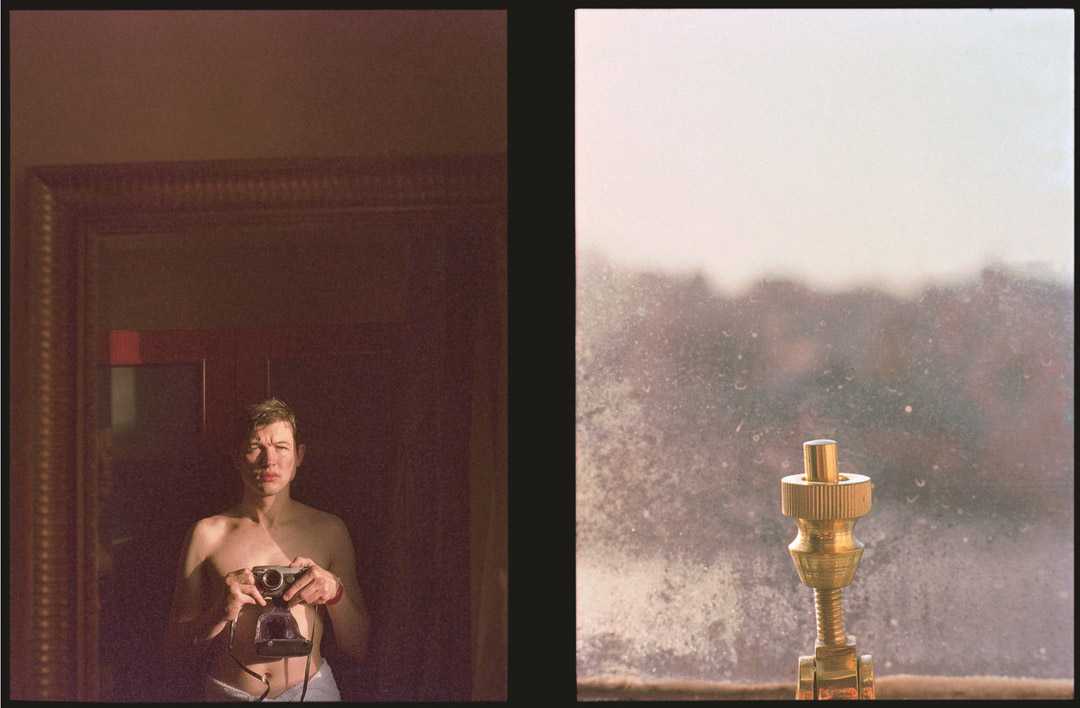
this is my favourite image of Fowler's as there is not a direct reflection of themes or subject however the shapes are similar, in the image on the left the shape to me feels bound and held back, the light seems to blind the person and the mirror the photo is taken in reduces the amount of information given and leads to the photo feeling contained as it creates a frame. the image on the right also has this feeling as the blur of the window reduces information and creates boundaries.
this is my favourite image of Fowler's as there is not a direct reflection of themes or subject however the shapes are similar, in the image on the left the shape to me feels bound and held back, the light seems to blind the person and the mirror the photo is taken in reduces the amount of information given and leads to the photo feeling contained as it creates a frame. the image on the right also has this feeling as the blur of the window reduces information and creates boundaries.
The nature of piecing together two photos means that there are both themes within the photos and the diptychs creation, fowler sees this in two ways, the idea of film as it is the stitching together of individual images, condensing these into just two images some of these are call and response or a mirror to each other yet each encapsulates a range of themes. fowler also sees the diptych as two photos of the view much like the images produced by the eyes that produce a whole image.
Alicja Brodowicz
this series focuses on the syncronicity of nature and the human body


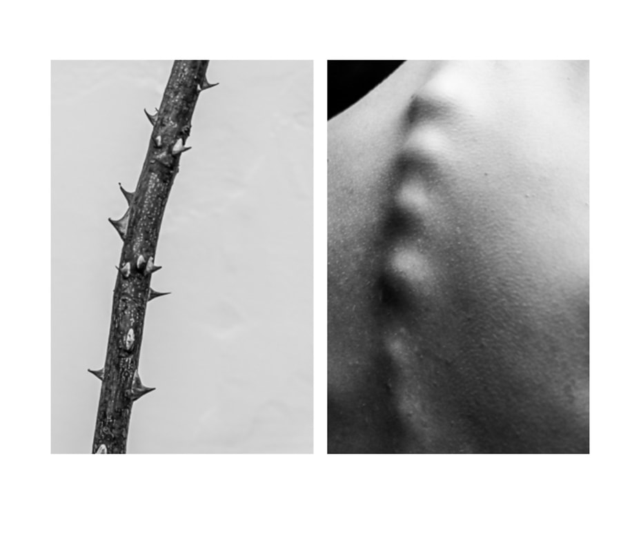
thisis my favrioute image as while the shape is similar they are photographed from diffrent angles, the shapes in the photo on the right are created with shadows and light while on the left they are made from cleare shapes
Prompt diptych


i didnt like these as i was not able to interprate the prompts well.
personal diptych by chance
sees every diptych as a film, blinking
I prefer this series as i was able to use my relationship with the models as insperation.
|
|
|


The dèrive
psychogeography describes the effect of a location on the emotions and behaviour of someone. a derive in Guy Debord's words is "a mode of experimental behavior linked to the conditions of urban society: a technique of rapid passage through varied ambiances."
The dérive's goals include studying the terrain of the city (psychogeography) and emotional disorientation, both of which lead to the potential creation of Situations.
My dérive
I made this walk everyday during lockdown and wanted to reexperience the wonder i would take. i also wanted to give an honest representation of what a walk through my area looks like therefore the series is comprised of photos of tree covered wealthy streets and a greyer normal ex council estate. the first few photos i took looked quite simple so i looked at the larger area . In the ex council estate the streets bend around eachother and wrapped round unmaintained greens , in the wealthy area the houses are detached and the trees line the street so that you can barley see the end of the


